• Welcome to the new COTI server. We've moved the Citizens to a new server. Please let us know in the COTI Website issue forum if you find any problems.
  • We, the systems administration staff, apologize for this unexpected outage of the boards. We have resolved the root cause of the problem and there should be no further disruptions.

CT Only: Continuing down the LBB recreation rabbit hole.

So, now I am in a "How Far Is Going Too Far?" moment.

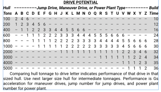
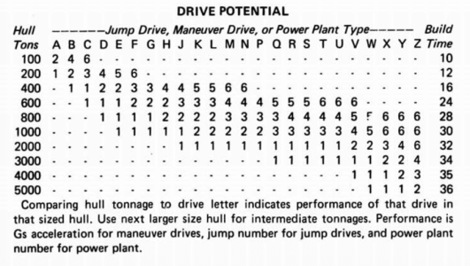
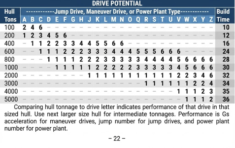
I'm on Page 22 and working on the Drive Potential Table. This is the original table from the 1981 LBB:
1766241518579.png

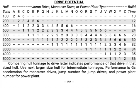
In my version, I added alternating rows of grey to make it easier to read:
1766241556368.png
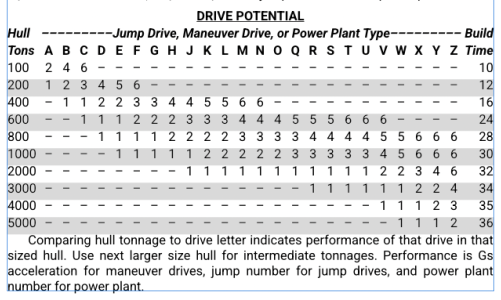
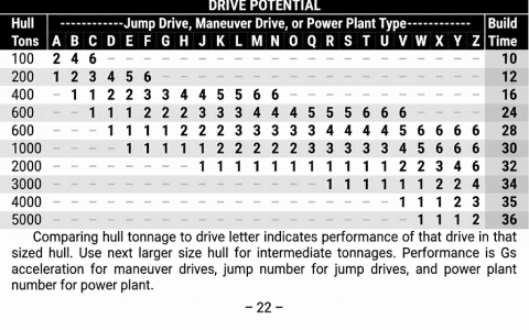
But then I had some fun and threw it at Google Gemini and asked it to make the table look better, and it came up with this design:
1766241606053.png
If the books were in color, Gemini gave me this:
1766241648083.png
I think the color table, though impressive, is going too far. It would also increase the POD print costs by needing to do color.

My version with the alternating rows, I think, balances maintaining the appearance of the LBBs and adding a little readability improvement to the original.

But the black and white Gemini version looks nice. And I think it's easier to read that my little update.
 
So, now I am in a "How Far Is Going Too Far?" moment.

I'm on Page 22 and working on the Drive Potential Table. This is the original table from the 1981 LBB:

View attachment 7146

In my version, I added alternating rows of grey to make it easier to read:

View attachment 7147
But then I had some fun and threw it at Google Gemini and asked it to make the table look better, and it came up with this design:

View attachment 7148
If the books were in color, Gemini gave me this:

View attachment 7149
I think the color table, though impressive, is going too far. It would also increase the POD print costs by needing to do color.

My version with the alternating rows, I think, balances maintaining the appearance of the LBBs and adding a little readability improvement to the original.

But the black and white Gemini version looks nice. And I think it's easier to read that my little update.
I prefer your reworked version: maybe if the "Build Time" were not bolded in the Gemini version I'd prefer that (if the idea is to bold the important bit, then I think just the contents of the table, "Drive Potential" per the heading, should be bolded. But also not a fan of white text on black background.
 
1766252450184.png
(Image from @plazman30 )

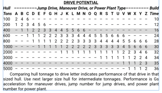
When I create these sort of tables, I find shading every third row (instead of every other row) easier to use. It is easier for the eye to follow the wide white and narrow grey stripes without jumping a row. It is still easy to differentiate the white row above a grey row from the white row below a grey row.

Maybe shade rows 100, 600, 2000 & 5000.
Just something to try out and see how you like it.
 
Why stop there?
On_Beyond_Zebra.jpg
Oh, right. No room left on the page...

(Apologies for the off-topic content. I really like this project!)
 
View attachment 7150
(Image from @plazman30 )

When I create these sort of tables, I find shading every third row (instead of every other row) easier to use. It is easier for the eye to follow the wide white and narrow grey stripes without jumping a row. It is still easy to differentiate the white row above a grey row from the white row below a grey row.

Maybe shade rows 100, 600, 2000 & 5000.
Just something to try out and see how you like it.
LIke this?

1766262500084.png
 
Honestly can't say those look any better. Maybe on larger tables, but with one that short, alternate rows seems better to me.
 
Back
Top