• Welcome to the new COTI server. We've moved the Citizens to a new server. Please let us know in the COTI Website issue forum if you find any problems.
  • We, the systems administration staff, apologize for this unexpected outage of the boards. We have resolved the root cause of the problem and there should be no further disruptions.

CT Only: The Traveller Book Dust Jacket Replica is now live on Travellers' Aid Society!

plazman30

SOC-12
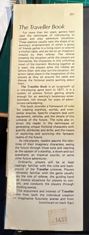
After a lot of measuring, and a lot of delays because I had to move in with my elderly parents TWICE to help with health issues, I FINALLY finished my replica of The Traveller Booko Dust Jacker.

A couple of notes:

  1. Marc Miller asked that I make an 'exact replica' and not change the dust jacket. I had plans to swap out the GDW logo with the FFE logo. And I wanted to put his current image in there.
  2. By the time I finally got this done, Traveller ownership change from Marc Miller to Mongoose Publishing, so I had to wait a couple of days for Mongoose Publishing to give me a thumbs up on this.
  3. There are two versions of the dust jacket. One fits the new POD book from DriveThruRPG. The other fits the original book from 1982. So if your old dust jacket is rather beat up, you now have a way to upgrade it.
  4. Since the original book came out in 1982, GDW did that dust jacket by hand. So, the fonts were probably different. But only slightly. Digital versions of fonts are rarely exactly the same as their old analog counterparts. But they're probably 99% identical and only a true font nerd using a loupe could tell the difference.
  5. The text on the inside of the dust flaps in not an exact layout match. The text is identical to the original. But I just drew a text box that same size as the original and imported the text and justified it. Remember point 4, where fonts are going to be a 100% match. Some of the word wraps may not exactly match the original cover, even though 100% of the text is there.
  6. There is a HUGE regular version, and a "compressed" version. I ran the compressed version through the app PDF Squeezer on a Mac on light compression.
  7. The Original file is 25.5×11 inches. The POD file is 26×11.42 inches.
  8. All files are FREE.
  9. Files are available on The Travellers' Aid Society on DriveThruRPG

I had the POD cover printed out at Staples in the US. On heavyweight paper; it cost me US$18.

I bought a Brodart Dust Jacket Protector and put the dust jacket inside it, and this is what the final product looks like:

ASaIfsB.jpeg


WX63ht8.jpeg


0EV9nGZ.jpeg


WM1TKvY.jpeg


Ce74NfM.jpeg


I hope someone finds this useful.
 
Er, is that exotic alien beats as in a disco or mos eisley jazz combo, or a typo and supposed to be exotic alien beasts?
 
Are you not allowed to offer it as pay what you want?

I think you should be getting some reward for your work in this.

I am. But I chose not to. I made a clone of an existing piece of art, and had fun doing it. I'm still trying to figure out DriveThruRPG to see if I can see how many copies have been downloaed.
 
Second paragraph on the inside flap: "a role-playing born in 1977". Should that be "a role-playing game"? I've never seen the original, so I don't know if this is an accurate repro.
 
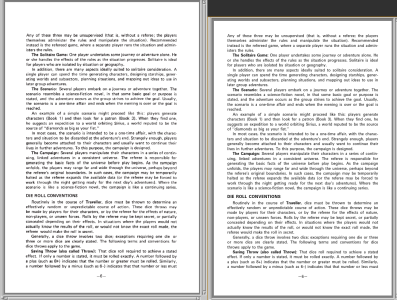
Awesome work! Incidentally, I've been toying around with something similar. I have been able to reproduce a few pages of the LBB/LWB almost exactly in the troff typesetting system. Check out the screenshot below! :) I had to specify where it was allowed to hyphenate. Other than that, layout is automatic with only slight differences in output.

Anyway, during that process I've discovered a few things about the original typesetting:
  • They strongly favored spacing between words over hyphenation (hence my having to control that).
  • They replaced some of the letters with narrower versions. I'm willing to bet that this is also what causes most of the variation in your case. The text font is Univers Regular, but the letters 'a', 'e', 's', 'v' (at least) are set in Univers Condensed.
  • No kerning (the original presumably used metal type or similar non-digital means).
  • [LBB] Font size is 8.5 point in printer's points which are not the same size as the "DTP points" used in digital processes (72.27 per inch vs. 72 per inch).
  • [LBB] Line spacing is 11 (printer's) pt.
ctrepro.png
 
Last edited:
That's a lot of work. I don't know if I would want to create anything in that level of detail.

I was playing with LBB conversions. The text itself is not bad. But converting the tables over is a huge PITA.

I'd be willing to pursue is as a group effort, but to convert stuff individually would take way too long.
 
I'll admit that I have yet to do the first floating figure/table which is on page 5 and a very simple one. I'm going to do at least that one and see how far it takes me. This might well end up just being a fun learning experience rather than a project with any useful output. ;)

That being said, the strength of troff is in its programmability, so fairly complex stuff can be automated/abstracted; it is comparable to (low-level) TeX in that regard.
 
It's an interesting exercise to be sure, I just don't know if the end result will be worth it to have a pixel perfect clone of the originals.

It'll be interesting to see a post-mortem of getting the floating box done. Then you can take a stab at some of the tables.
 
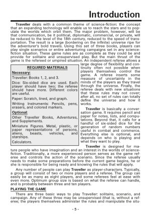
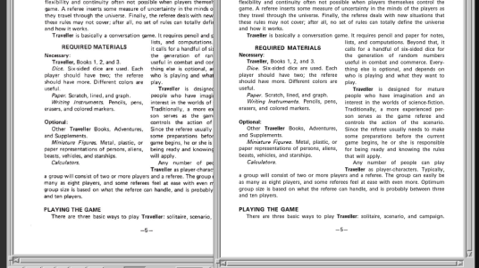
My efforts (which I believe I posted here), involved doing a "remastered" version. Same text. Same general layout. Same book size. But cleaned up tables.

I posted some screen shots here:

 
Yea, that looks great. Just there's a difference between "same general layout" and a pixel perfect copy.

Yours is much easier since there's less fiddling that the other effort is trying.
Absolutely. I wasn't willing to go with a pixel-perfect copy. I wonder if it might be easier to do this in LaTeX. I need an excuse to learn LaTeX.
 
Back
Top