• Welcome to the new COTI server. We've moved the Citizens to a new server. Please let us know in the COTI Website issue forum if you find any problems.
  • We, the systems administration staff, apologize for this unexpected outage of the boards. We have resolved the root cause of the problem and there should be no further disruptions.

Player's Book: Cover Art

What sort of cover art should a Player's Book have?


  • Total voters
    83
  • Poll closed .
I think you're right that the old black book covers might not appeal to the new generation. Then again, since T5 is focused more on mechanics than setting (I may be wrong there), it seems more appropriate.

I would go with a plainer, which can be stark or dramatic, design. Look at some of the promo stuff for The Expanse. The one with a woman being spaced with Mars in the background. Or close up of ice chunks in a ring around a gas giant. Minimal to call back to the old LBB covers, but dramatic, with action.

Maybe you want to highlight some of the classic themes Traveller is known for; shotguns and spaceships is what I think of. Maybe a shattered asteroid or comet, a guy in a spacesuit or armor, holding a shotgun, maybe a classic type ship in the background, but mostly a large field of black with the title up on one corner.
 
I think one of the best covers I have ever seen was the one for the first sourcebook for TNE:1248 - Out of the Darkness. It was not only a very simple but inspiring scene, but also was the perfect visual representation of what the book-title implied: A lone type-S scout seen from a distance achieving orbit about a world as the sun was rising over its horizon from orbit.

So what do you want to say Traveller is? In a single but simple picture - what says that? My opinion is that flashy and complex pictures do not necessarily grab the eye - a simple (and well done) piece of art that doesn't overwhelm the senses is what generally will intrigue me.
 
I am a huge Fan of Rapheal Lacoste
http://raphaellacoste.bigcartel.com/

Raphael-Lacoste
Canadian Artist
Art Director Of Assassin's Creed Franchise. <-----


I think this image sets the tone brilliantly for a traveller book.
windupgirl_Print-13x19.jpg


lets see...
spaceship/Airship? :alpha:
modern city :alpha:
market :alpha:
low tech on display :alpha:
strange transport? :alpha:
gritty and clean at the same time :alpha:
 
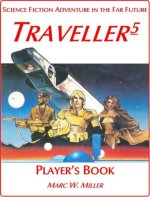
That reminds me of the cover for Citizen of the Galaxy, which is also a nicely iconic spaceships-and-barbarians image.

yeah similar motif

Cover has to be not so busy that the title doesn't stand out, must have areas of negative space allocated, colourful to catch the eye, in the flavour of the game, and must be consistent with the art style within the book (this last one of course is arguable)


the following is from http://www.writersdigest.com/editor-blogs/there-are-no-rules/general/10-tips-for-effective-book-covers

The title should be big and easy to read. This is more important than ever. (Many people will first encounter your cover on a screen, not on a shelf.) This is such a well-worn cliche of cover design that I have a designer friend with a Facebook photo album called “Make the Title Bigger.”
Don’t forget to review a thumbnail image of the cover. Is the cover compelling at a small size? More people are buying books on a Kindle or mobile device, so you want the cover to read clearly no matter where it appears. You should also anticipate what the cover looks like in grayscale.
Do not use any of the following fonts (anywhere!): Comic Sans or Papyrus. These fonts are only acceptable if you are writing a humor book, or intentionally attempting to create a design that publishing professionals will laugh at.
No font explosions! (And avoid special styling.) Usually a cover should not use more than 2 fonts. Avoid the temptation to put words in caps, italics caps, outlined caps, etc. Do not “shape” the type either.
Do not use your own artwork, or your children’s artwork, on the cover. There are a few rare exceptions to this, but let’s assume you are NOT one of them. It’s almost always a terrible idea.
Do not use cheap clip art on your cover. I’m talking about the stuff that comes free with Microsoft Word or other cheap layout programs. Quality stock photography is OK. (iStockPhoto is one reliable source for quality images.)
Do not stick an image inside a box on the cover. I call this the “T-shirt” design. It looks extremely amateurish.
Avoid gradients. It’s especially game-over if you have a cover with a rainbow gradient.
Avoid garish color combinations. Sometimes such covers are meant to catch people’s attention. Usually, it just makes your book look freakish.
Finally: Don’t design your own cover. The only people who should consider designing their own covers are professional graphic designers—and even then, it’s not advisable.


the following is from http://www.graphic-design.com/DTG/Design/book_covers/
read the original as well as it goes into much deeper detail and is a worthwhile read.

1. Know the material
2. Know the reader
3. Show the essence of the message
4. Layout to promote eyeflow
How do we do that?
NOTE THIS 1. Organize size of element in order of importance
NOTE THIS 2. Select color of element to stand out, and harmonize
NOTE THIS 3. Organize placement of elements to flow through the visual "story"
NOTE THIS 4. Make sure the reader's eye moves effortlessly from element to element​
Slants. How about those slants? Slants must have a reason, and they should (usually) run in the same direction. If you break that rule, you should have an excellent reason, supporting the design.
Vertical type! If you introduce vertical type, it should run UP. The end of the passage must end in a position to continue the eye to the next element! Not off the page. (As in "down") If you break that rule, you should have an excellent reason, supporting the design.
Word weight? Weighting the words in typography is very important. There should be a clear and justified reason for sizing each element -- and that relates to hierarchy -- from most important to least important. Being the 3rd edition is not nearly as important as the author's name, and neither are as important as the qualifier or USP, which for this book is the 2nd most important element after the word Photoshop.
Color breaks! Why the two 'O's in Photoshop are red, we have no idea. But you can immediately see how that treatment completely destroys the word as a word.
There are only two criteria for breaking a word with letter colors:
NOTE THIS 1. Intent: there must be a clear reason, in support of the message
NOTE THIS 2. Readability: the word must be instantly readable as a single word.​

Typography in Graphic Design
... type is your most powerful weapon - use it wisely

Contrast, posture and flow:
Elements in harmony, design with a purpose:
Blockbuster Illustration:

makes a great book cover? The one that makes someone purchase a book. While all of the entries had merit, there is one true winner -- the one that sells
 
Probably not very interesting, or as marketable as most covers, but I'd like the Player's Book to have the same minimalist design of the LBBs, or the T5 Core.
But instead of white text on black with the red stripe, it would be a different colour scheme.
I thinking along the lines of the Striker books which were yellow and white text over black and the text was regular instead of italic.
That's my 2 cents-worth.
 
White and Red on Black, similar to the LBB and the Starter Edition cover. Why go spend extra money and drive up the price?
 
White and Red on Black, similar to the LBB and the Starter Edition cover. Why go spend extra money and drive up the price?


hmm I could have swore I replied to this already:

The Point of graphics on the new player handbook is that it works as a advertisement for the system in game stores. As we are trying (I assume we all are) to increase the number of players we need to market to those who have either never played Traveller but have played other SF RPGs and those who play other genres. The Market is not 1977 or 1985 now, players expect more from their books. Old school covers could get away with the minimalist look, but modern books don't sell when they have that look. Something that stands out on the game shop shelf and prompts people to pick up the book to flip through.
A book should be attractive (one of the many principles of marketing) if you want to attract new people to the hobby.

otoh I would totally be down for a dust jacketed book that has the old style cover under the dust jacket and a dynamic artwork dust cover.***AS A SPECIAL EDITION ONLY***

Rob do you know if you are looking at soft or hardcover for the Player Handbook?
 
Forty Kay is big on mixing technology with medieval imagery, since half of combat is predicated on being close.

I don't think that is what we are looking for :) a TL15 planet will always smash a TL7 planet...

I think a less than violent imagery is best for the front - Traveller is economics by any means:rofl:

(I would not object to a space battle on the back cover or as an inside graphic on a dust jacket or inside the cover)

inside cover + first page could be a two page spread of a trillion credit squadron battle :p
 
hmm I could have swore I replied to this already:

The Point of graphics on the new player handbook is that it works as a advertisement for the system in game stores. As we are trying (I assume we all are) to increase the number of players we need to market to those who have either never played Traveller but have played other SF RPGs and those who play other genres. The Market is not 1977 or 1985 now, players expect more from their books. Old school covers could get away with the minimalist look, but modern books don't sell when they have that look. Something that stands out on the game shop shelf and prompts people to pick up the book to flip through.
A book should be attractive (one of the many principles of marketing) if you want to attract new people to the hobby.

Agreed, that's why I mentioned that my preference would not be very marketable.
The ideal layout for attracting new players to Traveller (or the hobby in general) would be a full colour, hardback book with gorgeous colour art throughout.
The Core Book would stay the same as it is, so everybody wins
 
Agreed, that's why I mentioned that my preference would not be very marketable.
The ideal layout for attracting new players to Traveller (or the hobby in general) would be a full colour, hardback book with gorgeous colour art throughout.
The Core Book would stay the same as it is, so everybody wins

Would you care to ask a printer for the cost of producing such a book? You might be very surprised as to the cost for the print job. Then translate that cost into a retail price. A target price for a Player's book should be about $20. Getting change from the $20 would be nice, but not absolutely critical.

To avoid that, you could go to a straight PDF download, and totally avoid the print costs. That does significantly affect attracting a new audience.

The current pricing for a full-color, hardcover book with a maximum of 90 pages, from a publishing company that I have used, for a print run of 1,000 is $8.60 per book, payable upon receipt, or an upfront cost of $8,600. For a run of 3,000 books, $7.85 per book, or $7,850 up front. Note, you would also have to store the unsold books, as the publisher would not do that for you.

For a book larger than 90 pages, as I suspect that the Players book will be, that is a special pricing quote.

The following is a quote from their website covering payment terms.

We require 1/3 of the estimated total cost be sent with your order. The next 1/3 installment is required when your proof is returned to us. The balance, including shipping costs and any adjustments, is due upon completion of your book and prior to shipping.

As a rule of thumb, you would take the production cost and multiply by 6 to get the retail price. You might be able to get away with a multiple of 4 if you have a lot of pre-orders. So, for a 90-page, full color, hardcover book, you are looking at somewhere around $31.40 for a print run of 3,000 books, assuming a retail multiple of 4. For a smaller print run, you are looking at $34.40, again using a multiple of 4. The multiple of 4 does not give you a whole lot of profit selling to wholesale distributors, who typically pay 40% of retail, and sell for 60% of retail. A multiple of 6 gives you a bit of a cushion.
 
Last edited:
price comparison for different systems, cover types and media

Retail Prices in USD
these are msrp and may not reflect what is available on amazon (used books and clearance books mess with prices)

price in following order
1 Hardcover
2 Softcover
3 PDF

DND5 players handbook
49.95$
-
-

Gamma World Player's Handbook
34.95$
-
14.99$

DC Adventures Heroes Handbook
39.95$
-
19.95$

Alternity Player's Handbook
29.95$
-
9.99$

EverQuest Player's Handbook
29.95$

Pathfinder RPG: Advanced Class Guide
39.99$
-
9.99$

Castles & Crusades Players Handbook
29.99$
-
19.99

Savage Worlds < variable worldname > players guides
-
19.99
9.99


around 35$ - 40$ should be the selected price point (+S&H)
I would say that if you buy the Hardcover the pdf is free otherwise the PDF should be around 15$ as the low is 10$ and the high is 20$
 
The T5 Kickstarter campaign was very successful. Would this be an option for the Player's Book?
Would a KS campaign help towards cushioning some of the costs?
 
The original Kickstarter was supposed to cover that - below is a copy & paste from the original campaign page:

"The Player's Book

By popular demand, we have committed to producing the Traveller5 Player's Book: a handy digest-size rules reference tailored for use by Players but without the (primarily) Referee’s rules. We expect to produce a printed version in Spring 2013, but every Backer who orders a Book will receive a link to an Ebook version when it is complete."

It's obviously been delayed a bit, fair enough.

Ah yes, I forgot about that. Interestingly it says:
"a handy digest-size rules reference"
To me that sounds like it may be similar to the LLBs or even the digest-size reissue of the 3 core LBBs that was published around the time of T20.
If we are looking at digest-size then it might also be something like Fate Core.
I would be perfectly happy with that format.
 
I've handled the Fate Core book, and yes, I think that's the size Marc is thinking about. Not quite as small a format as the LBBs, I think.

I have the Fate Core book and the Fate System Tool Kit. Both are hardback with black and white art throughout and the cover is full colour with a nice velvety-matt finish.
I also have the Fate Worlds books. They are the same size but with a soft cover.
For my taste, either of these formats would be perfect for the Player's Book. They are easy to handle, easy to pick up and read or refer to, and easy to pack into a bag.
Whatever format the Player's Book turns out to be I will be happy, but the above mentioned formats are spot on for me.
 
Back
Top