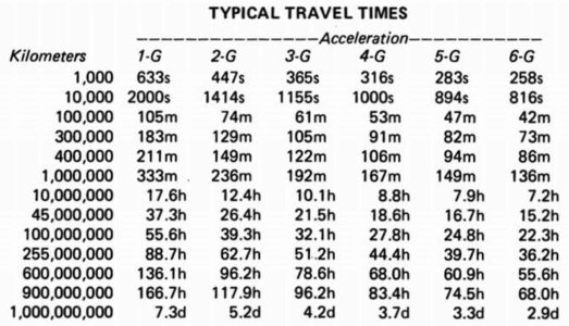
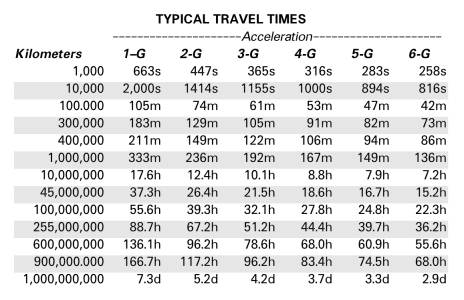
Now that I finished recreating Book 3, I dove into Book 1 and Book 2. Book 1 is with proofreaders now. And Book 2 is about 75% done.
So, why am I doing this?
Well for a few reasons:
1. I find stuff like this fun to do. I'm a professional IT guy, and I have always loved typography. I find working on stuff like this relaxing.
2. I'm trying to learn how to use my desktop publishing software better. This was my first attempt at doing anything longer than a few pages. I learned a lot of new things.
3. With Book 2, I switched from Scribus to Affinity, which allowed me to learn something new.
One challenge in doing these is font licensing. The LBBs used Univers and Optima, which are owned by Monotype and now carry a rather expensive yearly, per book, per year font rental fee for PDFs. Obviously, this is a personal project, so that doesn't impact me. But if I am going through the effort, it would be nice to let the people that own the rights to these books to make use of the effort I've gone through. So, I don't want to burden rights holders with expensive licensing fees.
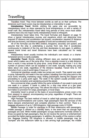
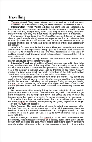
Right now I have two fonts which are reasonable substitutes for Univers and Optima. But I went through a "What if" scenario this morning. I fired up Google Gemini and asked it to give me the best possible free (OpenSIL licensed) font that would be a good substitute for Univers. Then I asked it for a good heading font to use with it, and it came up with these two fonts:
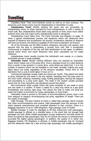
Clearly, this doesn't match the LBBs. So, the purists who want an exact match will immediately hate this. But just looking at it as a "remastered" version of the LBBs, I like the look of this.
Opinions?
So, why am I doing this?
Well for a few reasons:
1. I find stuff like this fun to do. I'm a professional IT guy, and I have always loved typography. I find working on stuff like this relaxing.
2. I'm trying to learn how to use my desktop publishing software better. This was my first attempt at doing anything longer than a few pages. I learned a lot of new things.
3. With Book 2, I switched from Scribus to Affinity, which allowed me to learn something new.
One challenge in doing these is font licensing. The LBBs used Univers and Optima, which are owned by Monotype and now carry a rather expensive yearly, per book, per year font rental fee for PDFs. Obviously, this is a personal project, so that doesn't impact me. But if I am going through the effort, it would be nice to let the people that own the rights to these books to make use of the effort I've gone through. So, I don't want to burden rights holders with expensive licensing fees.
Right now I have two fonts which are reasonable substitutes for Univers and Optima. But I went through a "What if" scenario this morning. I fired up Google Gemini and asked it to give me the best possible free (OpenSIL licensed) font that would be a good substitute for Univers. Then I asked it for a good heading font to use with it, and it came up with these two fonts:

Clearly, this doesn't match the LBBs. So, the purists who want an exact match will immediately hate this. But just looking at it as a "remastered" version of the LBBs, I like the look of this.
Opinions?

