• Welcome to the new COTI server. We've moved the Citizens to a new server. Please let us know in the COTI Website issue forum if you find any problems.
  • We, the systems administration staff, apologize for this unexpected outage of the boards. We have resolved the root cause of the problem and there should be no further disruptions.

For those who don't like Foss

kafka47

SOC-14 5K
Marquis
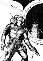
Well, as most people know I am a big fan of Chris Foss' work and think that he did an adequate job for T4. I would not really employ him beyond T4 but I think his contribution was valid.

However, the point of my thread is for all those who don't like Foss. Who else don't you like? As recently I have come across people who also do not like Larry Elmore, Monte Michael Moore, Keith Parkinson, EVE Online Art... and they like old skool fantasy art (you know the Wizards with the moon & stars cone hats). It is no slight upon you guys and girls...I just want to understand you.

As for me Traveller art has always been about Realism & Action therefore has always been on the cutting edge. However, I am beginning to recognize that sometimes it has to do with when you entered gaming. For me, I started around 1981 which may have influenced my sense of the aesthetic of the game.
 
Last edited:
I like all sorts of scifi and fantasy art, but to me Traveller = Keith, and IMO his elegant, understated yet awesome b/w art is worlds apart from the candy-colored Cadillacs of Chris Foss. If Foss's art had been the first Trav art I had seen OTOH, I would probably have no problem with it.

This will mark me as not really a true grognard, but... I do like some of the work of the second D&D artist generation, i.e. Elmore, Parkinson, and I can never remember #3. Also, Siembieda's dragons.

As for what I don't like... most MegaTraveller and D&D 2E art. I find it bland. In general, I prefer vast landscapes in fantasy and spaceships in scifi to close-up scenes of combat. I want images of worlds ripe for exploration and adventure.
 
Well, it's weird art to me. Not bad, just not to my taste.

You can envision the Keith's work because it's representative of the setting, not something with a hundred tiny specs of lit windows that could be in the setting, but isn't. Especially the stuff that bends at odd angles or has something projecting out just to make it look busy.

I downloaded several of Foss' pix from a website, but by and large I don't use it because it simply doesn't fit my vision of the setting.

I don't know if he did most of the ships in the T4 main book or not. Some of those I really liked (new take on standard designs). The 30 ton Ship's Boat was nice and the yacht was interesting. Some of the others were okay.

But when I think Traveller I usually come back to using the Type-S and the standard stuff. I like the art in the Mega Traveller CD which follows the traditional work.

>
 
For me, I like some Foss just fine, but not for traveller.

The pencils by Elmore in T4 I loved.

I love the color work on the MT covers. I like the Kieth Brothers' works.

The Cover of T20 is good, but not exceptional. Most of the interior art is pretty good.

Most of the FASA interior illos for Battletech, STRPG, and Renegade legion ranged from crap to serviceable.
 
Last edited:
For me, I like some Foss just fine, but not for traveller.

The pencils by Elmore in T4 I loved.

I love the color work on the MT covers. I like the Kieth Brothers' works.

The Cover of T20 is good, but not exceptional. Most of the interior art is pretty good.

Most of the FASA interior illos for Battletech, STRPG, and Renegade legion ranged from crap to serviceable.


Absolutely! Chris Foss is a marvelous artist, whose giant space scenes have been very influential. However, I've always felt that, like most artists, he tends to focus on the art rather than on speculative realism. Look at the works of conceptual artists like Syd Mean and Ron Cobb, you'll see how much better SF scenes look when they've been drawn to look real.

I liked the Foss stuff in T4, some of it worked well for Traveller, although most of the colour plates where stock Foss art from the 70s. Elmore's pencil work rocked! I loved how they tell a story.
 
Who else don't you like?
I don't know about who, but I can say I don't like certain styles. I don't care all that much for manga. I also don't care all that much for extremely dirty, gritty, bleak, washed out art. Ah, ok, I don't like Christopher Shy's art. He's working on the wrong end of the color palette for me. Just my opinion. Ymmv.
 
I like both Foss and Keith's work.

Foss is a bit less hard sci fi and more space opera, certainly.

I take the bendy twisty parts as creative interpretation.

I am definitely influenced by both of those guys, along with Dietrick for Traveller scenario ideas.
 
I like this old German stuff from the Perry Rhodan books.
Yes, that is a nice one. Now we need for find someone who can colourise them...for what is a game without colour...Classic Traveller...even had 3 tone colours and the nice paintings for the covers of JTAS.
 
For me, the ultimate Traveller artist is David Deitrick.

His covers for the CT Alien Modules, Tarsus, Beltstrike, and Starer Traveller box are what Traveller looks like.

I really don't care for the Keith sketches, especially some of the pirated material from Syd Mead and a couple other examples from other artists.
 
I like any art that makes the players (and the GM :) ) go

I want that, I want to be there, thats cool, and Can I have that (item,equipment,gun).

Thats what kind of art there should be.

B&W leave more to the imagination but color evokes emotion.

Highly detail makes some drawl and others point out what is wrong with the picture.

So, any art that makes players wanting it to exist is my kind of Traveller art.

Dave Chase
 
There's a lot of Foss's stuff I like. I don't care for the lumpy striped space potatoes much, but the angular ships I like.

I usually see the Foss pics as the postcard picture version of the ship, before a few years hard service gives it that used and abused look. The Emperor sees it like the Foss painting in trials--or the Foss painting is the painting that represents an idealized version of a ship as originally proposed that as built leaks like a sieve and has patches welded on all over because some designer forgot to allow space for components being installed and removed, not just having the ship built around them.
 
I like his stuff. I don't like to think of a future where every ship is grey. So I like color and Foss is sort of a template for colorful ships in the future. I draw a lot of inspiration from them. I see a future with nose art too.

1_majic_fish.jpg
1_toad.jpg
 
I don't see colorful submarines, and none have nose art that I know of, in today's current navies. But then, I haven't looked at a picture of today's submarines in quite some time. I don't recall any WW1 or WW2 submarines being colorful, either, except for camouflage paint on top side to help avoid being seen by aircraft (Operation Petticoat does not count :D). Some had conning tower art, which is the same as nose art.

And I don't much like Foss, either. I've seen some that I like, but most I don't like.
 
Back
Top